Think native plants and wildlife-attracting gardens look messy? It doesn’t have to be that way. In this series, we’ll talk about the techniques involved in designing a beautiful wildlife garden.
Today’s tip goes well with my last piece of advice, which was to plant native and wildlife-attracting plants in masses:
The tip? Choose a simple color palette.
This is one of the biggest differences between professional designers and home gardeners: restraint in color selection. And don’t think I’m giving you a lecture here, because I’m talkin’ to myself too! Everything I know about good design goes right out the window when I’m planning my own home garden.
But when we’re creating a native plant or wildlife garden, doing something that looks cohesive and attractive to visitors is one of the key ways we can multiply our efforts for wildlife and become an ambassador, if you will, for this type of garden. Imagine the benefits your wildlife garden will bring if you can act as inspiration for your neighbors to do something similar for wildlife!
To that end, a simple color palette of no more than four colors works so well in pulling together the look of a garden. You can have a terrible eye for texture, make impulse purchases at the nursery, and do a one-of-this-one-of-that planting style, and as long as you stick within the same color family, your garden will look like it was designed by the most discerning of professionals. A garden with a defined palette also feels more like an extension of your home, because you can echo some of the themes you love indoors, in your outdoor setting.
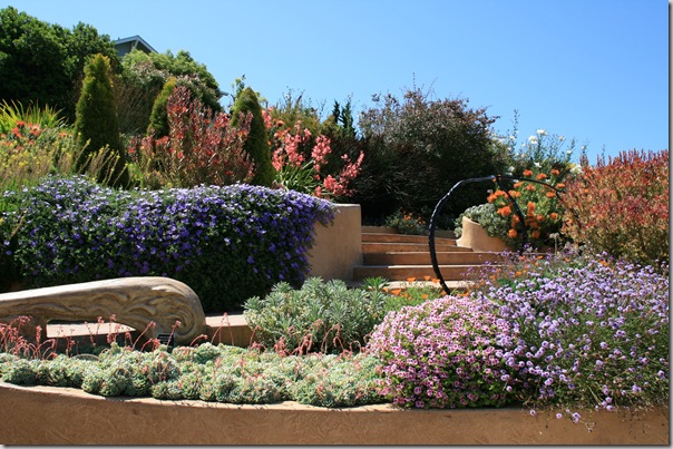
If the whole “planting in masses” thing gets you down because you just love plants too much to limit yourself, choosing a color palette is your ticket to a great planting design. Because most plants (even natives) are available in a variety of shades, if you fall in love with something there’s a decent chance you’ll be able to get one in orange, purple, cream, or whatever color you choose.
If you need help feeling confident picking your colors, rest assured, it’s mostly about relaxing and listening to your gut. There are an infinite number of right answers here. Keeyla Meadows talks about this a lot in her book Fearless Color Design. She suggests picking mini bouquets of flowers and foliage that make you feel good, and then putting them together in combinations until they seem to “work”.
I’m more geeky, so I personally take digital photos of plants I like (getting a nice close-up of foliage and flower) and then either print them out, or just move the open windows around my computer screen until I like the look of it all:
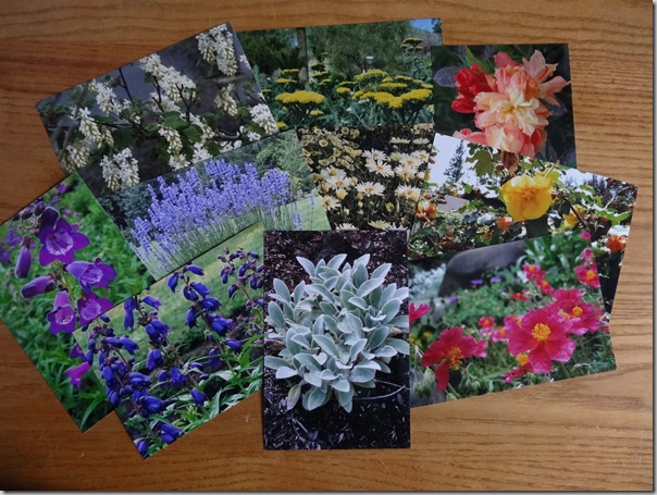
The best thing about choosing a limited palette is that it gives you a framework within which to be creative. I’ve found that once I decide on some creative parameters, it’s easier to do my best work. Sometimes just knowing that the whole wide world is an option can make garden design feel overwhelming and exhausting. Even more so when you keep bringing home disparate things from the nursery that just don’t feel right together (been there, done that!).
By figuring out what speaks to you color-wise and deciding to stick with that, you eliminate one of the biggest stumbling blocks in design. It’s strange, but sometimes setting a limit can enable even greater creativity within that theme.
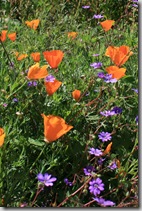 To get started, I’d suggest picking a few of your very favorite, must-have native or wildlife-attracting plants. California poppies? Check. De La Mina verbena? OK! Then think about what you’ve already gravitated towards in your home décor and see if there are any colors or styles you might like to bring outdoors, either in your plants, patios/ paths, or furniture choices. That can give you an easy starting point.
Most people seem to be attracted to either warm or cool colors (not both). But I’d encourage you that even if you’re pretty sure you only like warm colors like orange, coral and yellow, it’s a good idea to incorporate at least one contrasting color to give your brights some pop. Same goes if you generally prefer cooler tones – at least one bright in the mix can keep it all from looking dull.
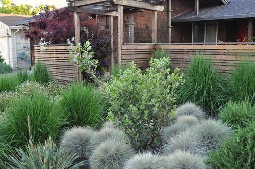
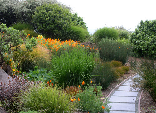
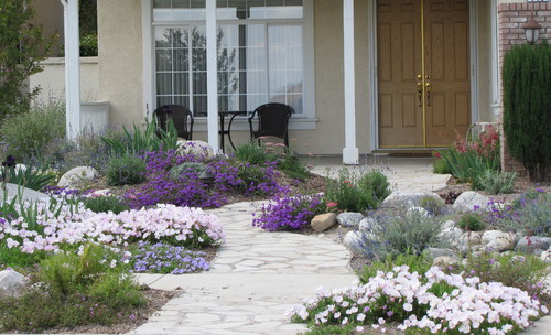
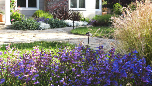
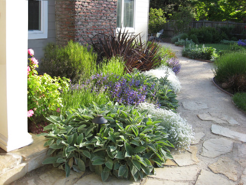
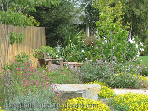
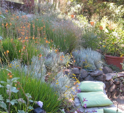
Here’s some inspiration of what a simple color palette might look like in a garden with native and wildlife-attracting plants:
Further reading: How to make your region’s plants pop
Photo at top courtesy of American Beauties Native Plants.
11 responses to “Wildlife Garden Design Tip: Choose a Simple Color Palette”
Absolutely stunning planting combinations here – very inspired! Great to see such attractive wildlife gardens. Love it!
Thanks, Rachel! The look of a wildlife-friendly garden really varies around the country and world, which is something I love. These are from California, and for the most part they feel like it. I like visiting another place and seeing something that reflects the specialness of that spot.
Simple color palette. So easy on the eyes. I think I like the last one the best.
Thanks, Lauren! Photos and illustrations have such power. I love the last one too – that peachy-orange color is lovely.
Gorgeous gardens, Gen. Just proves that a wildlife garden doesn’t have to look like a meadow or overgrown cottage yard. Your idea of using plant photos to design the garden is genius! I’m definitely going to use that one.
Thanks! I often struggle to create gardens that look harmonious when clients have a “must-have” list of plants that just don’t go together, so the photo trick helps out a lot.
Wow, these are really some beautiful and fascinating pictures that you have posted. Thanks a lot for sharing such an awesome post with us.
Thanks, Carl! Really appreciate your kind words.
[…] huge kudos to Gen who is finding ways to add more native plants into the gardens she designs for her clients. I know many garden designers have struggled with this, both from a “where do I find the […]
Genevieve, great article and tips. Well done! I’m glad you liked some of my photos (Dig Your Garden) to include in your article.
And thank you Lauren for the nice compliment too!
I also love how the green foliage and the orange flowers of the Bulbine contrast so nicely with the gray green foliage of the Santolina and Lavender.
[…] from Genevieve Schmidt, practice some restraint in your color selection when designing your wildlife habitat garden: a simple color palette of no more than four colors works so well in pulling together the look of a […]