With Halloween around the corner, what more appropriate topic to tackle than darkness? Specifically, dark and black foliage.
Black is dramatic. Unexpected. It’s all about contrast – between dark and light, living and dead. Like a glittered Day of the Dead skeleton, there’s a playfulness there, along with a somber dignity. Darkness in the garden must be used with intention, because whether you’re using it well or poorly, it will be noticed.
Here are some tips to rocking the darker tones:
Darkness adds depth to a small garden
 |
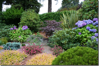 |
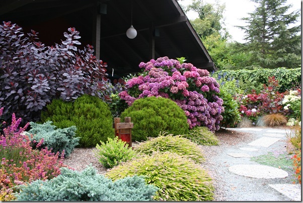
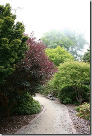
(Design by Ryan Scott (top), Patricia Wells (bottom left), and Ryan Scott (bottom right).)
Because dark colors often seem to recede into the backdrop, using them can be an easy way of fooling the eye into thinking a space is bigger than it really is.
In the top photo, the dark color and open form of the smoke bush (Cotinus coggygria) lends a feeling of airiness to the planting, and makes the garden feel larger than it really is. Had the designer chosen a green shrub instead, I think the garden could have felt walled-off.
You can see the same concept in play in the bottom right photo, in which the Japanese maple adds a feeling of depth to the garden bed. The ivy-covered wall behind it could feel fortress-like, if not for the skillful use of dark foliage to bring a textural and color contrast to the bed.
In the bottom left photo, this garden path feels mysterious and compelling because of the tension created by the dark-foliaged fuchsia tree obscuring the destination.
Using dark plants to play with shadows is an easy way to bring depth and spaciousness to the garden.
Let darkness punctuate rather than dominate
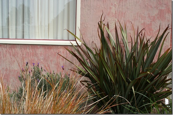
In this garden, the striking chocolate-black edges on this flax bring a needed balance to the warm tones of the home and the garden plants. Without the bold exclamation point of the flax, the pink color of the home could turn cloying. But the careful use of dark color as a contrast makes all the colors feel like part of an intentional design statement, and it works beautifully.
Use referee plants between potentially clashing colors
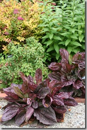 I wouldn’t be that keen on the gold of this spirea with the bronzed purple of this plantain, if not for the fact that they have a layer of green running interference between them.
“Referee” plants calm everyone down and smooth any potential clashes with a color and texture that’s hard to argue with.
While you’re getting comfortable introducing some dark colors into your garden, try putting a friendly layer of green in between any combinations you’re unsure of. As you figure out what works, you can become bolder in your pairings. (At left, design by Patricia Wells.)
Be playful!
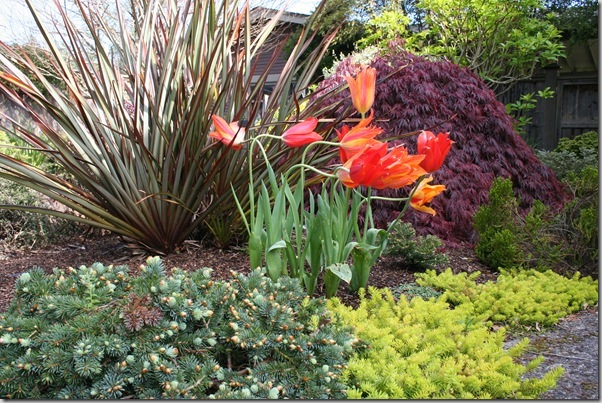
Dark plants needn’t feel somber. I love how this garden bed changes from refined to wildly exuberant with the addition of these tulips in spring. (Design by Tina Rousselot.)
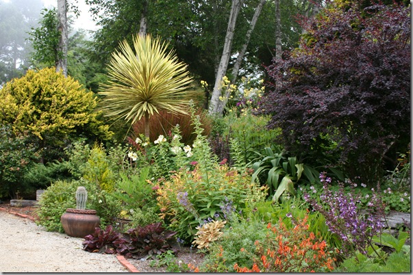
Above, this fearlessly colorful garden uses dark plants to accent and anchor a variety of flower colors and textures. The darkness of the foliage gives a feeling of structure and continuity that makes this enthusiastic perennial bed feel well-planned. (Design by Patricia Wells.)
19 responses to “Dark Designs: Black Foliage in the Garden”
[…] Genevieve Schmidt: North Coast Gardening […]
Great design tips, Gen! I love the idea of the “referee plants” — I think I’ve done that without realizing it, but now I’ll be more intentional when using dark and possibly clashing plant colors.
Thanks, Jenny! I’ve been experimenting so many interesting new plants lately that I had to figure out a trick for using some new colors and textures. It works!
Hi Gen, I’m with Jenny, the concept of referee plants is perfect for when you’re just starting out using dark colors. I love that flax plant – the lines and the color of the foliage are fantastic.
Hi Debbie! Isn’t that flax fantastic? Very architectural.
Fantastic tips here, Gen! Dark plants can be a bit tricky to get right, and you’ve given gardeners several ways to approach their design challenges. Thanks for the beautiful examples, too!
Thanks, Jocelyn! I loved your take on Darkness this month as well. The photos you chose really made me think about light and shadows more deeply.
Your photos are gorgeous, and your design advice about using dark foliage is helpful, Gen. I love all the dark-hued plants you are able to use in your climate. Dark foliage is a bit hard to come by in central Texas, where light, silvery hues predominate. So excuse me while I go back and drool over your pics again.
Pam, I feel awfully lucky to live in the climate I do, but I confess, you make gorgeous design look easy with your Texan plants! You really do a lovely job showing how to make them work. Maybe we can expect a new post on silvers from you soon? 🙂
Great ideas, Gen. I love dark plants but it’s easy to overdo with them. Your strategies sound excellent!
Thanks, Susan! That was really sweet of you to feature the post on Facebook!
Hate to pile on here but I agree with the other comments, excellent advice on the use of dark plants in design, especially the “referee”. I’m intrigued by the way the Purple Smoke bush draws the eye to the dark void behind the planting, as it seems to be bursting forth. Thanks Gen, I’ve made some very useful notes form you post!
Scott, isn’t that an interesting effect! The designer does a great job playing with colors.
Ohmygosh, Gen. I’m finally able to take a moment to read your post and holy cow – I love it! I’m always such a huge fan of maroon and black foliage, and you did such a wonderful job explaining how to use them in the garden. And I’m LOVING the term ‘referee plants’!
[…] For information on how to effectively use black foliage in the garden, check out this wonderful post written by Genevieve Schmidt at North Coast Gardening! […]
Great post Gen and deligthed to see your slant on the use of black plants. If used sparingly and in the right places they will be used more. Sometimes its frustrating as a plant person or nursery person to see over useage of these dark beauties out of context or contrast with for example green or gold foliage or white flowering Osteospernum for example. This is a blog piece I did a while back on a few dark beauties and black / dark foliage plants in general.
Pat.
OOps oh yeah ahemmm this is the blog post I mentioned above 🙂 http://fitzgeraldnurseries.blogspot.com/2009/11/black-or-dark-foliaged-plants.html
Pat, your story of piracy and Blackbeard-worthy treachery is a great read. Thanks for sharing!
Hi Genevieve,
What a thoughtful post on harnessing darkness in planting!
Loved the point about referee plants!
Thanks and best wishes
Robert