People who are color blind make up about 8% of men and .5% of women, and of those people, the vast majority aren’t actually color blind, it’s more that they see colors differently. Though we think of color blindness as seeing the world in black and white, the most common form of color blindness is where people have a weakness in the green receptors of their eyes. What would it be like to experience color that way?
Bob Davis, a dear client whose landscape I designed last year, described it by asking me to imagine a continuum of yellow, green and blue. Along that continuum, most of us see any number of subtle shades of yellow, yellow-green, green, green-blue, and blue. Bob sees yellow, green and blue, period. So all those gently contrasting greens rolling through the garden? It’s all pretty much the same color.
In addition, many tones of red actually appear green to him, making what might otherwise be a bold contrast of red flower against green foliage, well, kind of lackluster. Every spring, his wife Judy raves about the gorgeous red Camellia out back, but Bob just sees the same greenery he sees all year. He can make out the shapes of the flowers, but the color contrast of red against green is lost on him.
For us landscapers, color is the easy button for designing a garden. You come up with an awesome color combo, and even if your textural contrasts aren’t what they could be – eh, who’s gonna notice with all that splashy color? Those of us who can see the full color range notice color first. But for people who see limited numbers of colors, composition and contrast become key.
Bob was kind enough to give me some tips about what stands out most to him in a garden, what elements he sees most boldly and clearly, and which seem to be lacking to his eye.
But before we move on, a bit more color background:
Many people who are color-blind in the most common ways can see a single shade of blue or yellow, plus black and white most vividly. Colors like red and green are visible, but often look alike or lack subtleties in tone, and for many people greens can take on kind of a muddy appearance. Pinks can be visible as pink, or can look more white or more red/green, while purples often look like a single shade of blue. Orange is often visible as a distinct color, but isn’t necessarily the shade we’d expect.
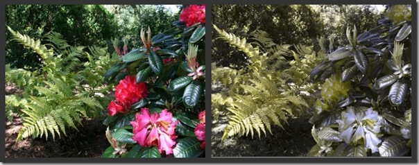
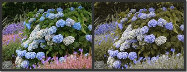
Here are two examples to show you how someone with color blindness might see a garden. (You can click to see the images larger.)
On the left, you can see the vivid contrast of red and green. But if you remove your reliance on the color contrasts, you can see that the textural contrast is what stands out:
In this next picture, much of the interest comes from the interplay of blue and purple, and the foliage color contrast between the heathers and the Hydrangea to create a bold accent. Once those subtleties are removed, you’re left with a more soothing monochromatic look:
Elements to focus on when designing a landscape for someone who is color-blind:
Contrast:
Because color isn’t the star of the show, contrast takes center stage. In order to adjust your eyes to see contrast and texture as more important than color, try taking black and white photos of gardens you love and see how they hold up when their reliance on color is taken away. Gardens Gone Wild has an excellent article about this.
Once you’ve started to adjust your mind, try playing with:
Light – the contrast of dark and light still works, even when subtle color variations don’t show up. While strong contrasts of black and white, dark and light can work to draw attention to focal areas throughout the garden, you can also play with light in more subtle ways by selecting trees that allow either a speckled pattern of light to shine through or throw a bold pattern of shadow on lawn or patio.
Designer Rebecca Sweet has an article that will help you see how to be playful with light in the garden.
Texture – set large leaves next to small frizzly leaves, lacy ferns in front of a substantial plant, grasses with softly draping leaves beside spruces with spiky needles.
Variegation – while the delicate striping on many plants doesn’t show up well, bold outlines in white or gold, particularly on larger leaves where the contrast is evident, show up as brightly as flowers otherwise would.
Flower color – just checking to see if you’re paying attention! Seriously, white shows up with boldness against most types of foliage, so if there are any white flowers you can use in your plan, they can help bring a bright splash of contrast and light to your garden. Yellow and blue also show up boldly for people with the most common types of color blindness.
Shapes:
Bob pointed out that using varying shapes can turn up the visual volume on a garden and allow it to shine even without the obvious lure of color. Try to vary, or do interesting things with:
Size – differing sizes add drama and interest – small in front of big next to medium, near a tree. It just adds a bit more variation to the whole picture.
Form – contrast a stiffly upright plant with one that has a weeping character, something tall and skinny and spiky next to something rounded and soft.
Big honkin’ flowers – You can see in the Hydrangea example above how boldly large flowers of the right color can stand out against the sameness of so many greens. Choose white, blue or yellow.
Layering and density – seeing through an open, waving, or lacy plant to a plant with a bolder presence can add interest by guiding the eyes through the garden and providing textural contrast.
Composition:
Because Bob is a photographer, he was able to share a number of tricks he uses in his photos that also translate well into the landscape.
Lead the eye – landscape designers are always thinking about focal points and where we want to lead people to look. But without being able to rely on bold color to lead people in the right direction, we need to pay more attention to where the sizes, shapes, and textures lead our eyes. Spiky grasses direct out gaze up and out, while trees with gently drooping leaf tips frame the picture and bring our eyes back down into the garden.
On a similar note, pathways or other elements that trail out of our line of sight create a sense of mystery and pleasant tension. Because our mind can’t fill in the ending, we’re draw to elements that seem to go beyond where we can see.
Structure the view – when garden rooms were all the rage a few years back, we were all thinking of how we framed and structured our view. In photography, the limits are more obvious, and we can choose what to include in the shot. In landscaping, the view is more open, but we can still pay attention to how we frame views from seating areas, windows and pathways.
Rule of 1/3’s – photographers use the rule of thirds to get the balance of their shot right. The idea is that elements that are centered are less visually interesting than ones that are offset by a ratio of thirds. You can see it in play in this photo. The sunset only takes up one-third of the visual space, but because of the drama of its placement, the sun takes prominence in this photo.

Non-color attributes and senses:
In order to amp up the enjoyment someone with color blindness is able to take from their garden, consider what other visual and non-visual attributes you can integrate.
Motion – Bob shared that because color isn’t the first thing he notices, he’ll often miss seeing a far-off person who is standing still, even if they are wearing red. But as soon as that person starts to move, his eye is drawn like a magnet.
Other people with differences in how they see color may also be more drawn by movement. Use swaying grasses, loosely waving perennials, and trees tall enough to ruffle in the breeze.
Attract Wildlife – hummingbirds, songbirds, honeybees and native bees can all bring life and joy to a garden. Attract wildlife as much as possible by providing a water source, shrubs for nesting, native plants and other plants that provide a year-round food source.
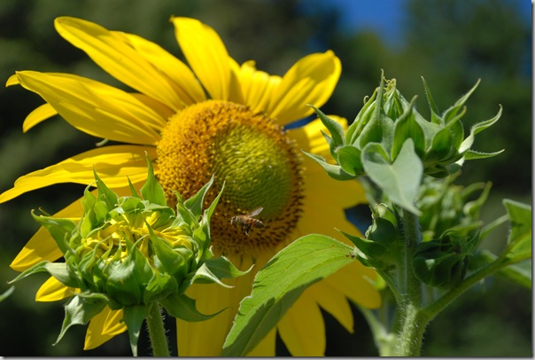
Sound – A trickling fountain, the rustle of trees or clumping bamboo, birds foraging – all contribute to a sense of aliveness in the garden.
Scent and taste – lemon blossoms, jasmine, herbs, fruit trees and vegetables all help bring your senses into the moment. When you stop to inhale a lovely fragrance or eat a blueberry off the shrub, you aren’t thinking about your tech issues or your pesky co-worker, you’re just there, enjoying the garden.
The most important thing to remember when designing for someone who is color-blind?
Ask questions, and listen. Remember that every human being experiences color differently and has different tastes. Bob, for example, loves blue, but even though he can see yellow clearly, it isn’t necessarily his favorite color.
Also, even though I’ve gone over the most common kind of color blindness here, there are a number of other types of color blindness, as well as an infinite number of variations on which shades people can detect and what those shades look like.
Going out to gardens together and viewing plants at the nursery to see what colors and types of contrast are most visually pleasing can be extremely valuable. Photos are also helpful, but because many people with color blindness can see synthetic colors (like in a book or on a car) more vividly than natural colors (like flowers or wood), you probably also want to get out in the real world and see what stands out best to them on actual plants.
Designing a garden for someone who is color blind isn’t reducing enjoyment for anyone else, rather it’s stealthily adding a whole new dimension of enjoyment.
If you’ve ever integrated plants that feed wildlife or are low-maintenance into a garden, you know that these kinds of changes on how you design a garden didn’t spoil how it looked in any way. It was more that you were adding another dimension that might not be visible to people (or creatures!) not in the know.
Designing to enhance enjoyment for someone who is color blind is the same way. None of these design tips would make a garden unattractive to someone who does see color, and you can still put your red flowers in without guilt! Rather, it’s just one more lens you can design through; one more element to consider when choosing between options.
Want to learn more about how people with color blindness see the world?
Color Blindness Vision Simulator
Wikipedia entry on the types of color blindness
See what other talented designers have to say on the topic of Therapy and Healing in the Garden:
Naomi Sachs : Therapeutic Landscapes Network : Beacon, NY
Ivette Soler : The Germinatrix : Los Angeles, CA
Jenny Petersen : J Petersen Garden Design : Austin TX
Lesley Hegarty & Robert Webber : Hegarty Webber Partnership : Bristol, UK
Rochelle Greayer : Studio “G” : Boston, MA
[print_link]
52 responses to “Designing a Landscape for Color Blind People”
Okay – seriously, Gen. WHEN are you going to write a book? You’re so amazing – no matter what the topic is, you engage, offer insightful information as well as gorgeous photos. I’m sending this to my friend whose husband is ‘color-challenged’. Very, very interesting! (and thanks for the shout-out, too!)
Awww, you are the sweetest, Rebecca! I’m totally blushing. I’d love to write a book someday… Thanks so much for sharing with your friend – I’m crossing my fingers and hoping I got it right!!
[…] Genevieve Schmidt : North Coast Gardening : Arcata, CA […]
[…] Schmidt, North Coast Gardening: Designing a Landscape for Colorblind People Ivette Soler, The Germinatrix: Plant a Garden, The Life You Save Might Be Your Own Jenny Petersen, […]
Awesome, Gen! And seriously, this is a topic I’d not considered before! What a great reminder to take in more subtle details as well as create a space that works for its steward. Bravo!
Isn’t it funny, Jenny? I never thought about that topic before either, but in the last couple years I’ve designed a few gardens for people who are color blind, and it’s been a really fascinating experience getting to think about landscapes so differently.
wow — super interesting post…I agree w/ rebecca — bookworthy
Thanks Rochelle! I can’t wait to dig into yours!
Great post! It’s funny, I’ve found information before about gardens for blind people, but never for colorblind – and my father is, in a big way. So, what a great perspective, and yes – when’s the book deal being signed?
Aww, thanks Naomi! It’s funny when you realize how MANY people are colorblind, and how little anyone’s talking about how to make things beautiful for someone who sees in that way.
[…] Genevieve Schmidt : North Coast Gardening : Arcata, CA […]
Finally! Someone standing up for the oppressed minority!
I’m Rebecca’s friend’s challenged husband.
Lovely article.
As one of the 7% afflicted, I’d make the following two observations.
A. Each of you paired photos look the same to me (of course).
B. I love pattern in gardens. I don’t know if this has anything to do with colorblindness, but I’m very attracted to symmetry and shape. For example, one of my favorite plants I’m the garden is euphorbia…
Alex, all I can say is PHEW!!! I am so relieved the photos looked the same to you! It is really hard to second guess what anyone else views, color-wise. I have the “is it blue or is it purple” discussion with people who see a full range all the time …
I love your observation about pattern, symmetry and shape. And I am a ridiculous Euphorbia fan as well – you’re quite right, the patterns there are fascinating.
Here’s an interesting anecdote;
My Dad was a marine in Korea. He had one colorblind guy in his unit who, apparently, was indispensable. While the color of camouflage over artillery positions in the distance fooled everyone else, this guy could zero in on the discrepancy in texture and pattern and point out the enemy every time. Or so the story went.
That’s awesome, Alex. I actually read about that in the Wikipedia entry on color blindness, that any time you have around 5% of a population having a trait it can no longer be considered a defect but a possible evolutionary advantage, and they mentioned that exact thing – how valuable that kind of vision is in catching movement or discrepancies in patterns in war. That’s amazing that your DAD experienced that in his unit!! Too cool.
That makes sense. Most animals don’t see the same range of colors that we do, but they often see things we can’t/don’t. Doesn’t seem all that crazy to think that the two things are connected.
My kids and I often get into philosphical discussions about color vision. People with nominally normal color vision all agree to call specific colors by the same names. However, there is no way to say that your experience of a given color is the same as someone elses.
Gen, What an interesting take on this month’s GDRT topic. I hate to admit it but I don’t think I’ve ever asked a client if they are colorblind or if anyone in the family is. It’ll be on my standard list of questions from now on. Your design tips all make so much sense once you take the colorblindness into account. And designing to add another dimension is always a good thing – no matter how you see color.
Thanks, Debbie! I gotta give props to Bob – he’s spent a lot of time analyzing how he sees things and he gave me a lot of uber-specific tips.
Isn’t it great how adding a dimension can provide more joy in the garden, without removing anything for everyone else? I feel that way about native plants sometimes, that they have this whole hidden life with bugs and birds and all of that – and all most people see is just a pretty plant or landscape.
What an interesting and insightful post. I’d never considered the color-blind garden before, although I’ve read about taking pics of a garden in b/w to see how it holds up without the distraction of color, which makes total sense. I’ll remember this post in case I ever have a color-blind client.
Thanks, Pam! The black and white photo thing really is amazing in how it strips away so much of what we normally rely on for interest and forces us to be more creative as designers.
Fascinating to read a completely different approach to healing.
Haven’t encountered a client who has admitted to colour problems, but if I do I will have some wonderful ideas up my sleeve.
I very much liked your point about it being another lens you design through.
How true!
Thanks and best wishes
Robert
It’s funny, a lot of people have differing vision and don’t even realize it. Most people with strong color blindness would know, but my partner’s Dad only just took a color test with us a year ago and realized he was missing some tones! And he’s one of the best photographers I know, as is Bob.
This is an amazing post!
I have never considered what a garden would be if you take away the colors. Its a very interesting point of view and a very important one if you truly want to make a complete garden. I admire how much work you put into the design
thank you so much for the eye opener.
Thank you, Fer! It’s a pleasure to have you stop by! I’m glad that my discussion with Bob was able to give you a fresh perspective on design! He certainly opened my eyes to a lot.
In art school one of our assignments was to take a painting and reproduce it in black and white, then look at the result. I still remember how the highlights stood out and how important the negative spaces were. When you go on to consider how the midtones might appear differently to different people, it creates a new way to look at a garden. I can see how designing with this information would be a wonderful, added tool.
I so appreciate the time and thoroughness of this article, particularly the image comparisons. Many of us who thrive on color always wonder what it would be like to be color blind. Thank you.
Thank you so much, Nancy! I’m honored that you appreciated the post.
Yes yes and YES!!! I am texture mad, so I often think about how the garden would look if it was only in b&w – but I am also a color FIEND and NEVER thought about how things change for the colorblind! This post is a wonderful synopsis of good design in general – we want ALL of the things you focus on, in every garden! I love it when what seems like a design challenge is a fantastic opportunity – WELL DONE!
XOXOIvette
You pegged it, Germi, with your “started as a design challenge and became an exciting opportunity” bit. That’s exactly it.
And you are so right, COLOR FIEND is exactly how I’d describe you!! LOL.
[…] How to Design a Garden for Color Blind People | North Coast Gardening […]
Gen=
This is one of my favorite garden blog posts ever…by you or anyone else! Fantastic article on a subject that we don’t hear about often and many don’t understand. THanks for opening my eyes to the world of the color blind. You really made me think a second time about color in the garden!
Shirley
What an honor, Shirley!! Thank you!
A friend’s brother was colorblind and had only blue and yellow flowers in his garden.
Love this discussion! Speaking of color and garden design, another group to consider is the elderly, who have trouble seeing colors as their eyes age. Light colors, like pink and lavender, read as grey, so gardens for seniors should really be planted with bright flowers (reds, oranges, yellows) and bold textures. Scent is also an important factor, since it’s the strongest memory trigger of all of our senses. Shrubs like lilacs and roses are often planted in elder care gardens for that very reason.
Naomi, this is fantastic info. Thank you so much. I design for a lot of older people and never knew this.
Fascinating info, Gen! I often think in terms of “how would this stand up with NO color,” but your/Bob’s insights into what exactly can and can’t be seen by a colorblind person are extremely helpful. Thanks for such a thorough post on this topic — it’s a keeper!
[…] topic is making its way around the landscape design community. It is written by Genevieve Schmidt. It appears on her website/blog North Coast Gardening. She rounded up research and then summarized recommendations to those gardeners who might encounter […]
Wow, designing a garden for color-blind people. Never thought of that before. Brilliant! It got me thinking about what a garden for blind people would be like. I suppose I would try to attract birds with nice songs, and have some running water, and of course wonderful smells.
Phil – you’re right on – in fact, I remember when I lived in San Francisco their botanical garden was in talks about creating a garden just like that – with scent and birds and a fountain and textural delights for people who cannot see at all. I don’t know if they ever did that, but everything you mentioned was on their intent statement.
LOVE THIS – what an amazing and wonderful contribution to garden design. Lovely! Beautiful! Helpful!
Shawna Coronado
Thank you so much, Shawna! I just got to speak with Bob last night after he read the article for the first time (he doesn’t have internet, so I printed it out) and I was so proud that he felt like I captured his thoughts and perceptions well. I am glad because I certainly couldn’t have written this post without his generous gift of time and expressiveness.
Would never have thought of this, amazing. shows there is no limit to one’s creativity and offering a new way to see, even for those with color blindness.
[…] How to Design a Garden for Color Blind People | North Coast Gardening […]
[…] beyond my superficial eye-color worries… my google search also led me to an article on Garden Design for Color Blind People. How great is […]
I thoroughly enjoyed reading your article! Very informative and well written. Thank you for adding such depth to garden and landscape design.
Genevieve, this post has gotten such amazing feedback, I think it should be more widely shared with readers of the Therapeutic Landscapes Network Blog. Would you be okay with that? If so, let’s talk about how we could do it (probably just a short intro by me, one of your images from the blog, and then pointing to this post right on your blog). What do you think?
Naomi, of course I’d be honored! Feel free to use some photos and a quote to illustrate your post. Let me know what I can do to help. Thank you so much for your kind words and desire to spread the word about this. I had no idea the sheer number of people affected by color-blindness until I began researching.
These comments have just brought back a memory: I once had a large beautiful bouquet of flowers delivered to a gentlemen in celebration of his birthday. I was unaware that he was colorblind until, in thanking me, he told me how he looked each flower up in a guidebook so he could fully experience the beauty of the bouquet.
Wow, Nancy. I can hardly imagine…
I’m so glad you took the time to put together this article! When I found out my boyfriend was colorblind I was devastated because I am moderately obsessed with color and I felt so bad for him that he can’t experience the things I experience visually! Ever since I found that out I have taken his “condition” into consideration for almost everything, including the way I dress and decorate. These are some great tips and I like the idea about seeing how something looks in black and white to see how texturally interesting it is. He always downplays his colorblindness (I imagine because he doesn’t know any different so he doesn’t know what he is missing), but I just want him to always have the most aesthetically pleasing experience possible. Thanks so much for drawing attention to this relatively common problem that the majority of people don’t realize exists and for providing such awesome images and advice for enhancing the visual experience for colorblind people!
[…] Genevieve Schmidt : North Coast Gardening : Arcata, CA […]